While I had conducted extensive user research, I knew I needed to test my new design and its features to see if it met all the requirements before shipping. To ensure a comprehensive evaluation, I incorporated the System Usability Scale (SUS) methodology alongside direct user scoring.
To see whether or not the new design improved efficiency while being intuitive, I asked participants to perform a series of tasks on maze using the new design and new features, as well as the old design, and asked them to give a usability score out of 10.
To measure the look and feel of the new design, participants also gave an appearance score out of 10.
Average score for the efficiency/intuitive test:
Average score for the appearance test:
Testing
New design
8.45
New design
9
Old design
3.8
Old design
4.2
After completing the tasks, participants filled out the SUS questionnaire, which consists of 10 standardized statements rated on a 5-point Likert scale. This methodology allowed me to obtain a quantitative measure of usability, which was then converted into a usability score out of 100.
Average SUS score for usability:
By integrating SUS with direct usability and appearance ratings, I was able to obtain both a standardized usability benchmark and actionable user feedback, ensuring the new design met user needs before deployment.
New design
81
Old design
47
User Flow


Searching for Housing
As a university student,
I want to access a platform that aggregates all available housing options near my university, so that I can efficiently compare prices, locations, and amenities to find the best fit for my needs.
Improve the UI and UX, redesigning the platform without compromising efficiency
Make the platform intuitive for everyone to use (students and parents)
Assisting My Child
As a parent of a university student,
I want a way to browse safe and affordable housing options near my child’s university, so that I can help them make an informed decision and ensure they live in a secure and convenient location.

Implement new features to streamline the search process and improve effectiveness (map view and advanced filtering)
Streamlined Search Experience
As a university student,
I want to efficiently refine my search to find housing options that meet my needs,
so that I can save time, easily compare the best choices, and visually explore locations, proximity to my campus, and nearby amenities like public transit, grocery stores, and restaurants.

For:
affyto
Role:
Product Designer
Tools:
Figma
Timeline:
Aug 2024 - Dec 2024
Team:
Noah Yu (me), 2 Dev
affyto
FIND YOUR SPACE
IN ONE PLACE
affyto

Lo-fis


Context:
Affyto is a Canadian startup revolutionizing student housing for university students. This innovative web app consolidates all available housing opportunities in a specific university location, leveraging advanced features to simplify the search process. With the largest database of listings in one platform, affyto ensures a seamless and efficient experience for students searching for housing.
Background:
As the lead product designer on the affyto team, I spearheaded the design of the web app experience. Over the course of five months, I collaborated closely with the lead developer to significantly enhance the UI and UX, building on the foundation of the existing MVP.
Problem Statement
Students struggle to find reliable, affordable and convenient off-campus housing due to disorganized and inefficient search processes. How might we help in navigating the student housing market more effectively?
Solution

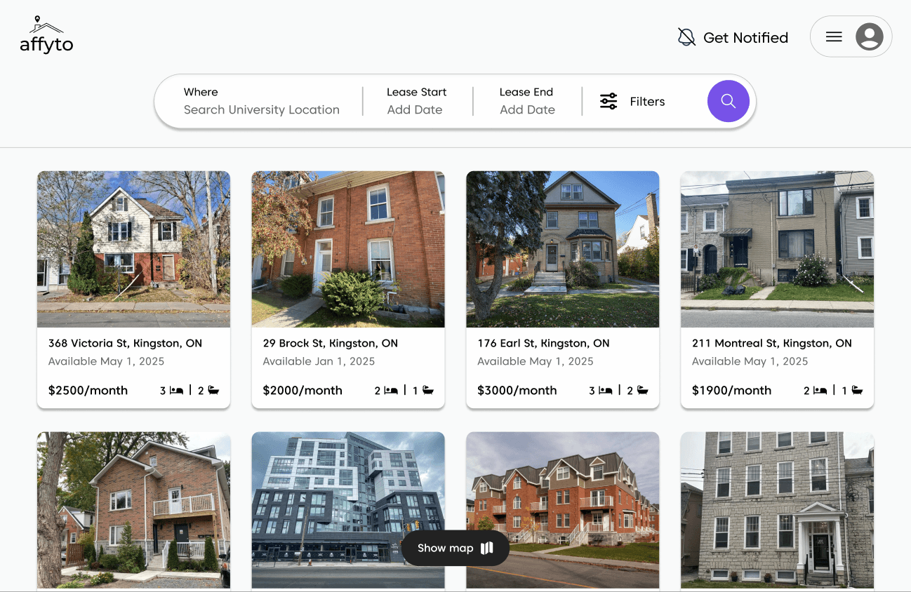
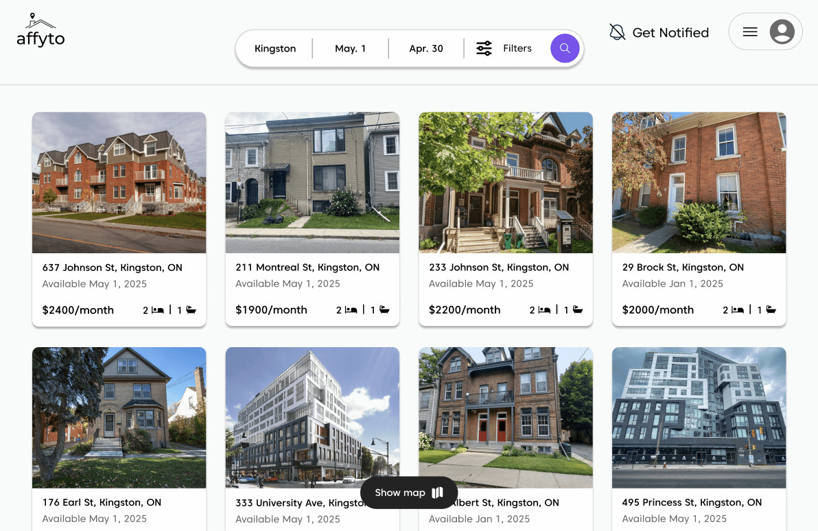
Optimized landing page
Get notified about new listings
Create your profile
Enhanced navigation bar

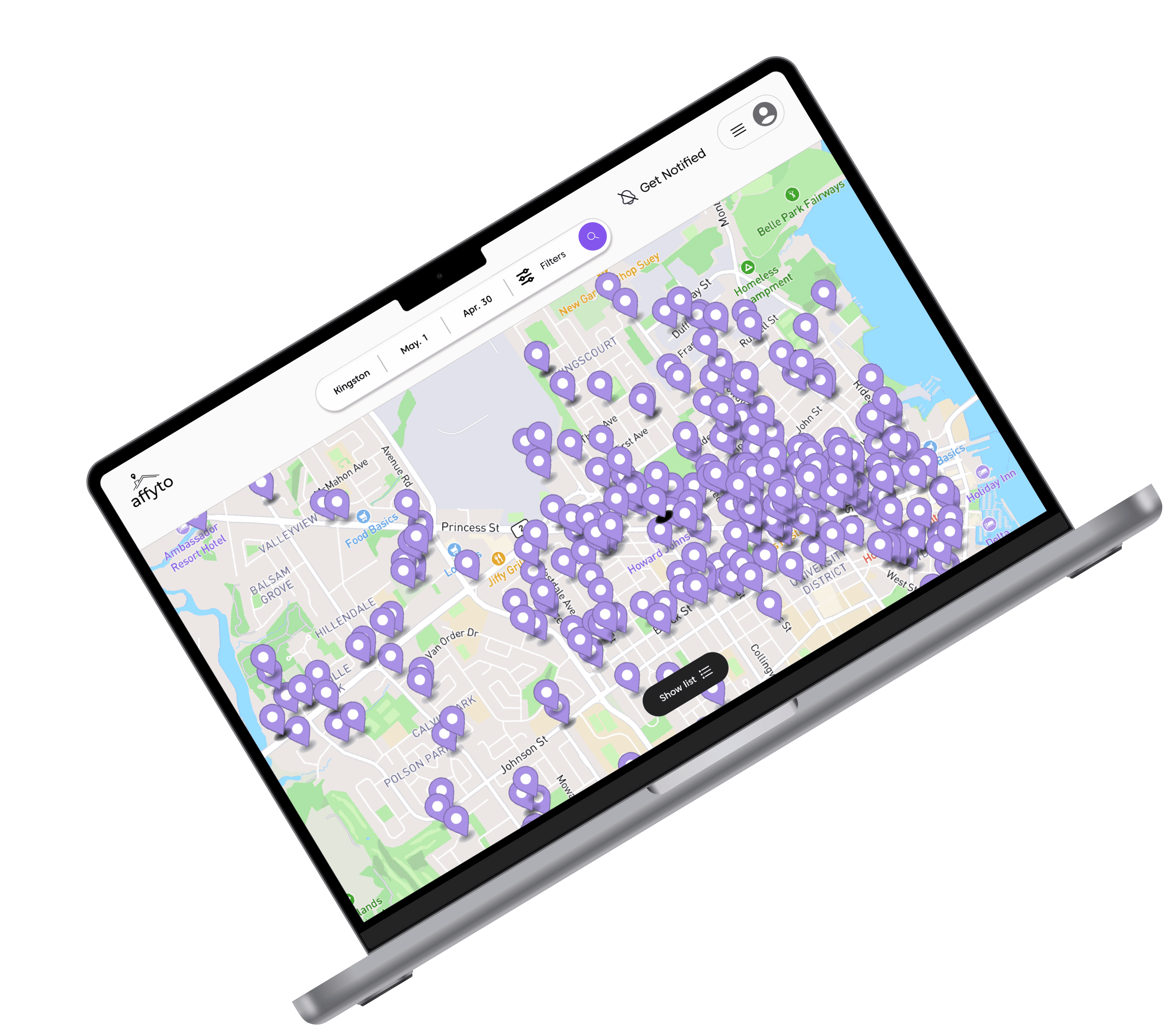
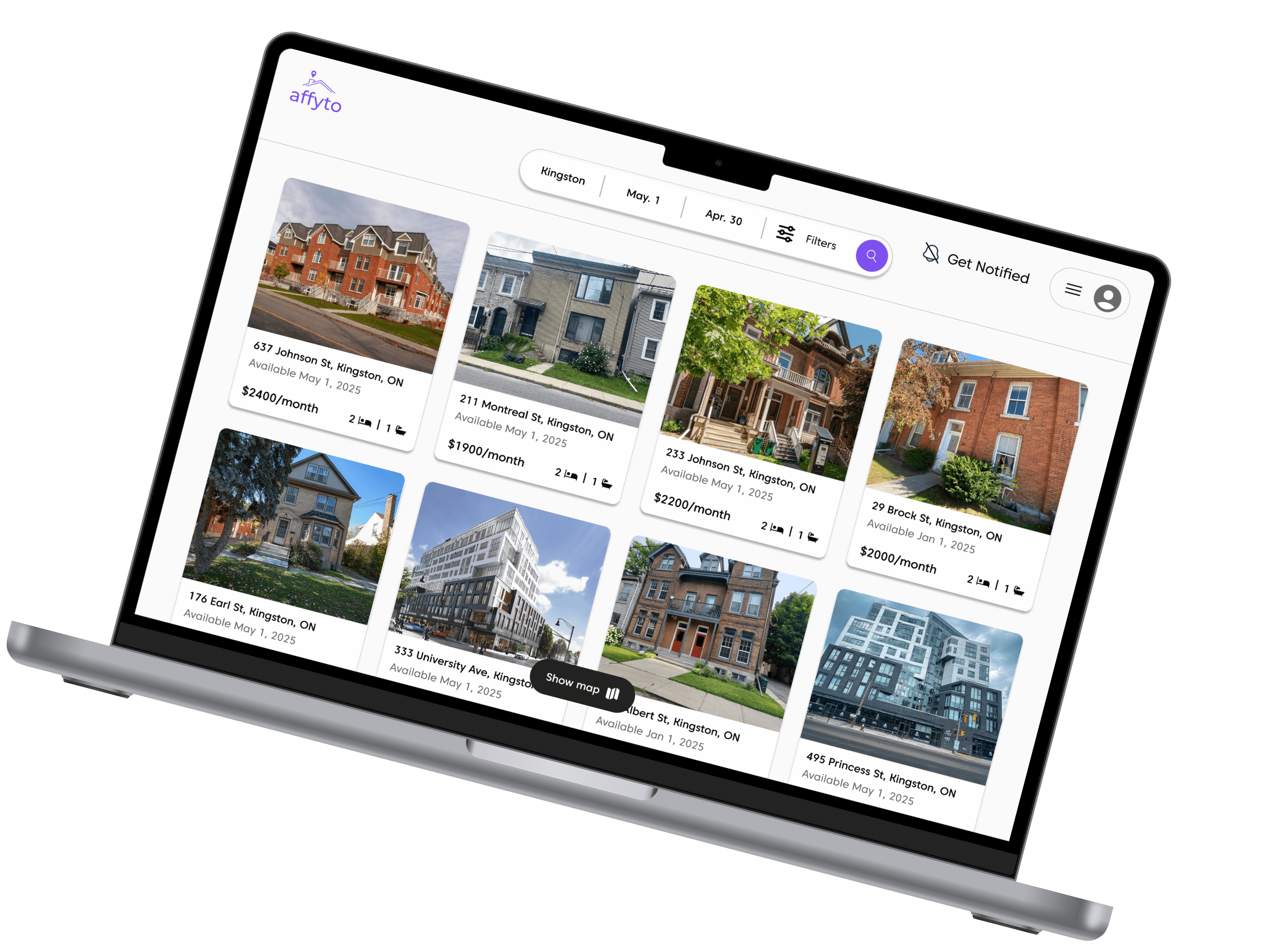
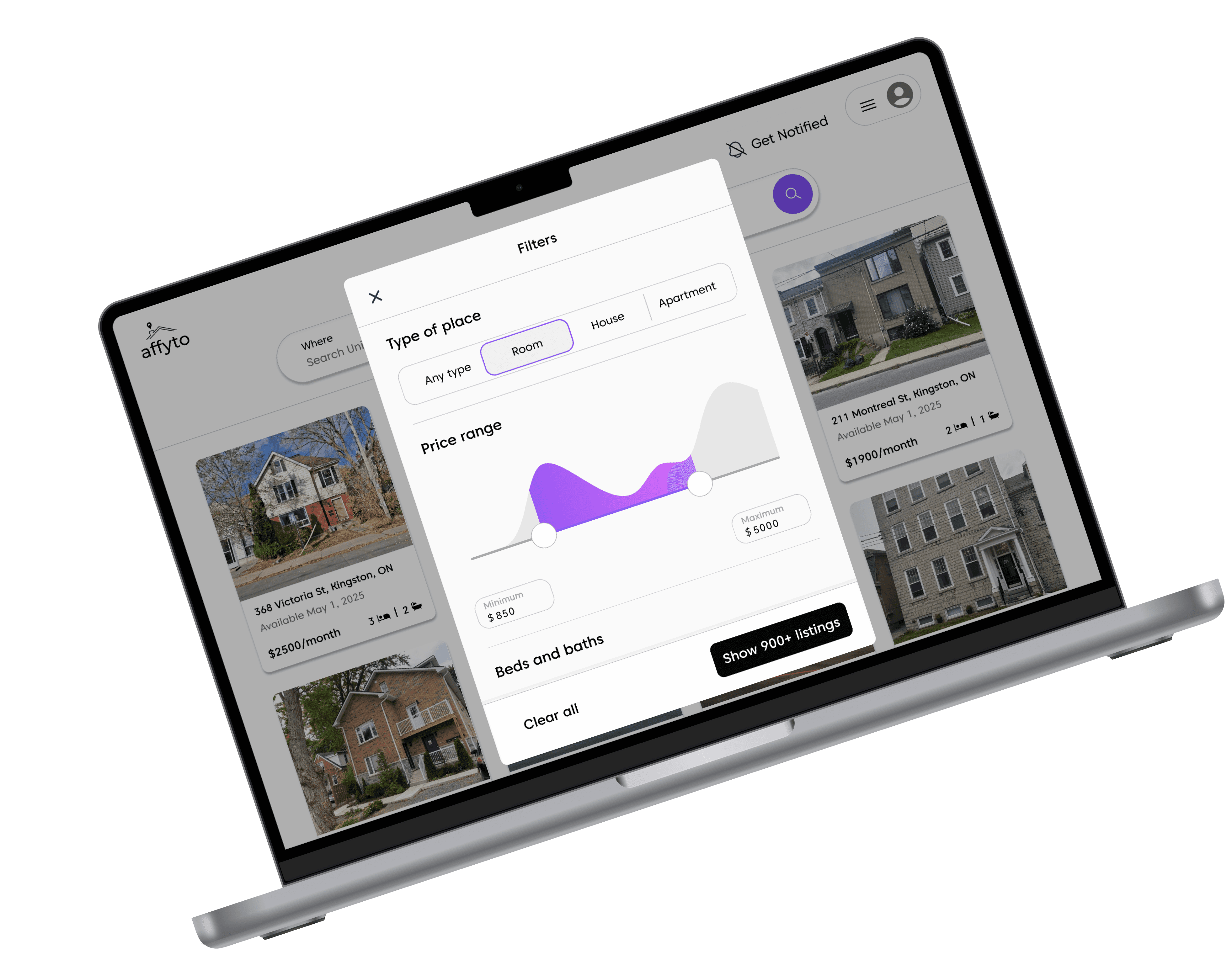
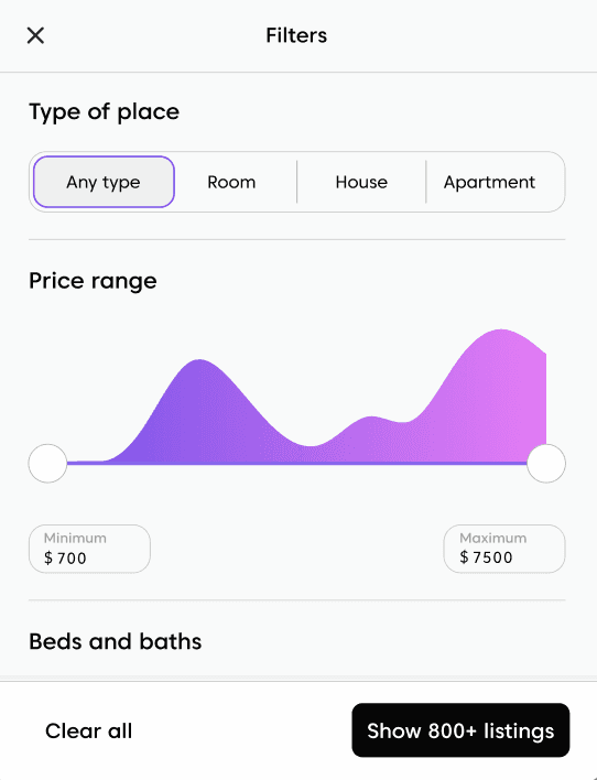
Comprehensive search with advanced filtering options
Set campus location and desired lease start and end date
Filter by listing type, price range, beds, baths, amenities, and sources

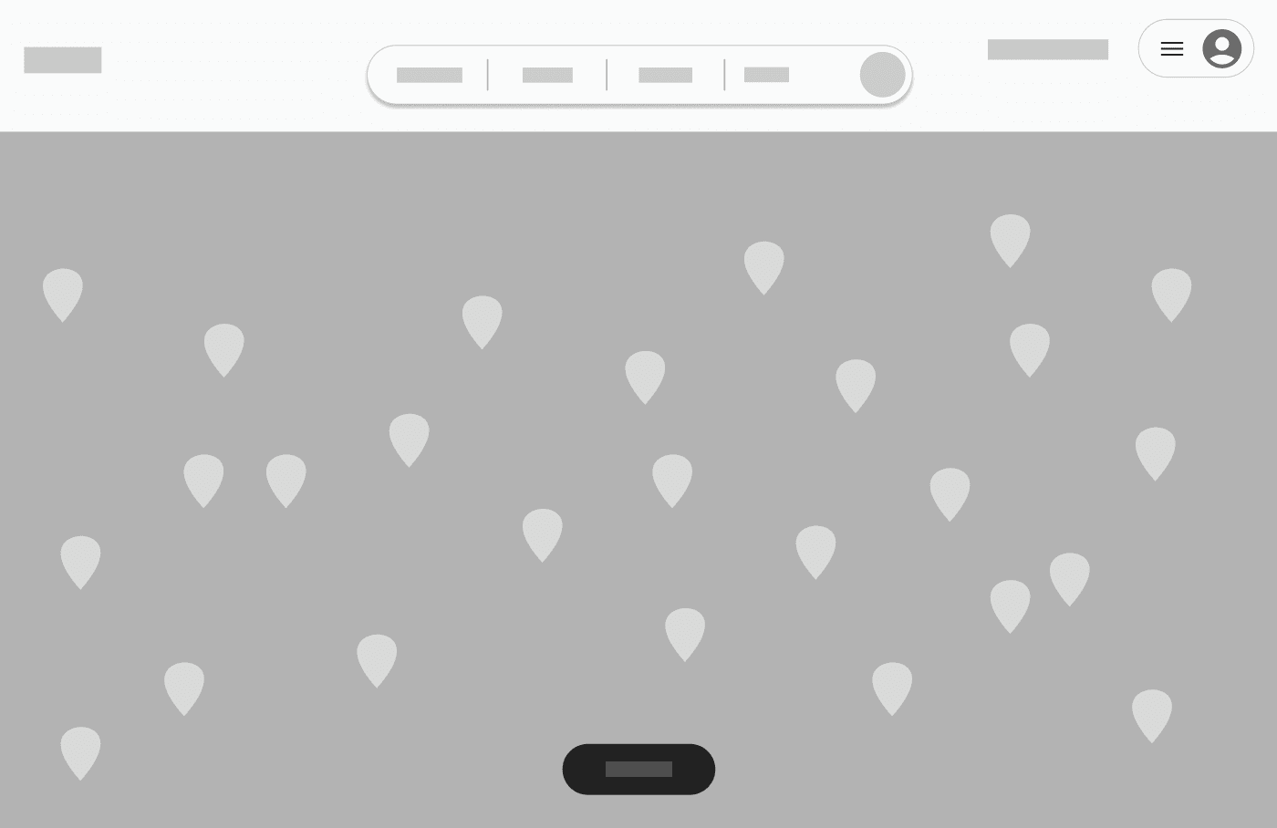
Interactive map view
Use the show map feature to explore prospective locations
Click on any listing to be directed to the exact property management site for full details and booking
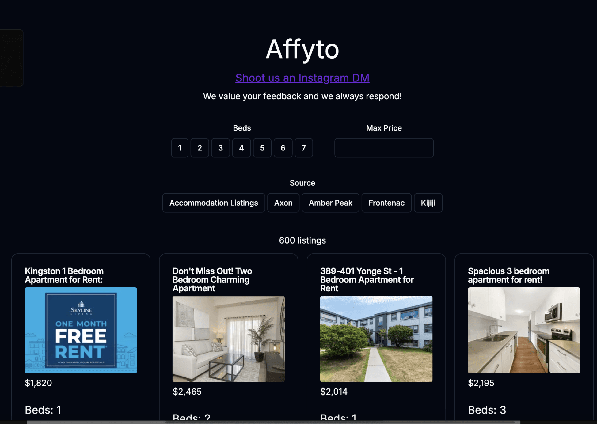
MVP
Redesign
Results
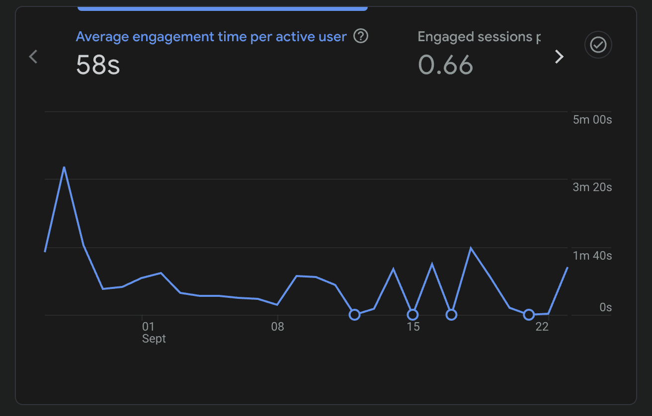
Following the implementation of the redesigned UI and enhanced UX, affyto released an updated version to its hundreds of waitlist users.
Doubled the number of engaged sessions per active user
Sustained the average engagement time per active user
Confirming the data from Firebase by talking directly with users, we concluded the following:
The significant increase in engaged sessions per user was a direct correlation with a more intuitive and enjoyable user experience that encouraged longer and more meaningful interactions with the platform
The sustained average engagement time per active user, coupled with nearly double the number of engaged sessions per active user, validates the enhanced user flow, improved intuitiveness, and increased efficiency of the app

Research
I conducted 30 user interviews with Canadian university students and parents and gathered insights from over 200 respondents through a user survey.
User Stories Design Goals
Learning about user motivations, frustrations, goals, and influences, I was able to craft the following user stories to narrow down product features and requirements.
Hi-fis


Reflection
As the sole designer, I had the opportunity to work directly with the lead developer and co-founders, giving me full creative autonomy over the design direction. This level of ownership allowed me to push my skills further and make impactful design decisions.
While the workload was demanding at times, it was also an invaluable learning experience that strengthened my ability to prioritize, adapt, and problem solve. Collaborating with a research partner or another designer would have further streamlined the process, but navigating these challenges independently helped me grow as a versatile and strategic designer.
On the technical side, I had the chance to explore advanced prototyping in Figma, experimenting with complex interactions such as an interactive price slider and variable-changing buttons. These features not only enhanced the usability of the product but also expanded my technical toolkit for future design projects.
Overall, this experience reinforced the critical role of user research and agile methodologies in driving informed design decisions. By conducting in-depth user interviews, mapping intuitive user flow, and crafting detailed user stories, I was able to define clear design requirements. This approach led to a 2x increase in engaged sessions per user, while maintaining efficiency and intuitiveness through an improved UI/UX and the implementation of key features.

UI/UX Benchmarking